Post by Saknika on Aug 31, 2009 23:03:26 GMT -5
End Date: September 30th 2009 11:59pm EST
For this community practice, we’re going to focus on Colour Theory. Please make sure you try to follow the steps to ensure you get the most out of this practice.
For this practice, there is to be no black and white either. You really want to focus on using colour, and black and white are merely the extreme ends in the shades of gray.
Colour theory is the study of how colour affects an image. By placing hot on cold, or vise-versa, you will get a specific feeling in your photograph. Same goes for placing hot on hot and cold on cold. Colours will naturally interact with each other, and as such knowing how they do so is beneficial to any photographer’s arsenal of creative knowledge.
Hot Colours: Red, Orange, Yellow
Cold Colours: Blue, Purple
Neutral Colour: Green
Green is considered a more neutral colour, because it can feel hot or cold depending on what it is placed next to. Most people generally regard it as a cold colour, however.
Here are the general effects of colour-on-colour:


There are also several colour schemes you can use to apply colour theory:
Primary: Yellow, Red, and Blue. These colours are the basis for all other colours.
Secondary: Orange, Purple, and Green. Created by mixing the primary colours.
Tertiary/Intermediate: Equal parts of the primary colours and their closest secondary colour.
Triadic: Any three hues that are equidistant from each other on the colour wheel. IE: The primary colours.
Complementary: Opposite colours on the colour wheel.
Split Complementary: One colour combined with two colours on each side of the first colour’s complementary colour.
Double Complementary: Two adjacent colours and their complementary colours directly opposite them on the colour wheel.
Analogous: Any three colours that are next to each other on the colour wheel.
Monochromatic: One colour and a range of its different values and intensities. The general rule of thumb is to use one pure colour, one lighter tint, and one darker shade.
Here are visual examples of the colour schemes for you to view:


By applying these sorts of colour schemes to your photographs, you’ll find that things seem to really stand out, and make a bigger statement.
Here’s how this is going to work. Please try to follow these steps when posting here.
1. Pick a colour scheme, and tell us which one you are trying to use in your photo.
2. Place the photo below that statement in your post.
3. Comment on the person (or people if you’d like) directly above you (this means the person who posted before you), and let them know if you feel they did well with their chosen colour scheme, and why you feel the did or did not do well. This should be after your image.
4. After receiving feedback, either re-shoot the image, or choose a different colour scheme and try again. Even if everyone loved your image, try to top your best!
5. Post the new image in the thread, following steps 1 and 2 as you do so. You don’t have to comment again if you don’t want to.
The person who shows the most improvement will get a place in the Showcase come October. You may re-shoot as many times as you’d like, providing there is at least one post between your last one. Since I will comment on every photo posted in here, there will be at least one post.
To help a bit, here is a form you can use when posting. This is optional.
When it comes to creating the photo, here’s what you’re looking to do, in general. You can follow this to an exact, or you can branch out away from it as much as you feel comfortable in doing.
You’re going to want to choose a colour scheme first. Then, taking one colour from that scheme, place it as your background. This could be construction paper, a wall, grass, the sky, ect. Then, take an object and place it against this background. The colour of the object(s), or clothes a person is wearing, should be the next colour(s) of the scheme you’ve chosen.
For example, you could do a red ball against green grass and it would be a complementary colour scheme.
If you have any questions, don’t be afraid to ask! This is a much more involved community practice than we’ve had in the past, but I hope that it’s a fun one for you all!
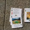
To get us started, here is something I did following a Complementary Colour Scheme of yellow and purple. As you can see, there is also green in this. That is okay, I don’t expect you to just have specific colours necessarily. But if you do have more outside the colour scheme, refer back to the colour-against-colour pallets above to see what the effect will be to try and make sure it works.

For this community practice, we’re going to focus on Colour Theory. Please make sure you try to follow the steps to ensure you get the most out of this practice.
For this practice, there is to be no black and white either. You really want to focus on using colour, and black and white are merely the extreme ends in the shades of gray.
Colour theory is the study of how colour affects an image. By placing hot on cold, or vise-versa, you will get a specific feeling in your photograph. Same goes for placing hot on hot and cold on cold. Colours will naturally interact with each other, and as such knowing how they do so is beneficial to any photographer’s arsenal of creative knowledge.
Hot Colours: Red, Orange, Yellow
Cold Colours: Blue, Purple
Neutral Colour: Green
Green is considered a more neutral colour, because it can feel hot or cold depending on what it is placed next to. Most people generally regard it as a cold colour, however.
Here are the general effects of colour-on-colour:
There are also several colour schemes you can use to apply colour theory:
Primary: Yellow, Red, and Blue. These colours are the basis for all other colours.
Secondary: Orange, Purple, and Green. Created by mixing the primary colours.
Tertiary/Intermediate: Equal parts of the primary colours and their closest secondary colour.
Triadic: Any three hues that are equidistant from each other on the colour wheel. IE: The primary colours.
Complementary: Opposite colours on the colour wheel.
Split Complementary: One colour combined with two colours on each side of the first colour’s complementary colour.
Double Complementary: Two adjacent colours and their complementary colours directly opposite them on the colour wheel.
Analogous: Any three colours that are next to each other on the colour wheel.
Monochromatic: One colour and a range of its different values and intensities. The general rule of thumb is to use one pure colour, one lighter tint, and one darker shade.
Here are visual examples of the colour schemes for you to view:
By applying these sorts of colour schemes to your photographs, you’ll find that things seem to really stand out, and make a bigger statement.
Here’s how this is going to work. Please try to follow these steps when posting here.
1. Pick a colour scheme, and tell us which one you are trying to use in your photo.
2. Place the photo below that statement in your post.
3. Comment on the person (or people if you’d like) directly above you (this means the person who posted before you), and let them know if you feel they did well with their chosen colour scheme, and why you feel the did or did not do well. This should be after your image.
4. After receiving feedback, either re-shoot the image, or choose a different colour scheme and try again. Even if everyone loved your image, try to top your best!
5. Post the new image in the thread, following steps 1 and 2 as you do so. You don’t have to comment again if you don’t want to.
The person who shows the most improvement will get a place in the Showcase come October. You may re-shoot as many times as you’d like, providing there is at least one post between your last one. Since I will comment on every photo posted in here, there will be at least one post.
To help a bit, here is a form you can use when posting. This is optional.
[b]Colour Scheme:[/b] Chosen scheme goes here
[b]My Photo:[/b] Photograph in image or linked form goes here
[b]__________’s Photo Above Mine:[/b] Comment goes here
When it comes to creating the photo, here’s what you’re looking to do, in general. You can follow this to an exact, or you can branch out away from it as much as you feel comfortable in doing.
You’re going to want to choose a colour scheme first. Then, taking one colour from that scheme, place it as your background. This could be construction paper, a wall, grass, the sky, ect. Then, take an object and place it against this background. The colour of the object(s), or clothes a person is wearing, should be the next colour(s) of the scheme you’ve chosen.
For example, you could do a red ball against green grass and it would be a complementary colour scheme.
If you have any questions, don’t be afraid to ask! This is a much more involved community practice than we’ve had in the past, but I hope that it’s a fun one for you all!
To get us started, here is something I did following a Complementary Colour Scheme of yellow and purple. As you can see, there is also green in this. That is okay, I don’t expect you to just have specific colours necessarily. But if you do have more outside the colour scheme, refer back to the colour-against-colour pallets above to see what the effect will be to try and make sure it works.